Now that we have our override variables file, let's start to customize our theme so it looks more interesting than stock Bootstrap. I'm going to start by customizing some colors.
Full List of Overridable Variables
The easiest way to get a full list of overridable variables is to look within the source of Bedrock. Looking at node_modules/@concretecms/bedrock/assets/bedrock/scss/frontend, I see that it currently is comprised of inclusions of
- Bootstrap
- Font Awesome (Free)
and some custom utilities and definitions created by Concrete. Since Concrete doesn't currently provide any default variables for Bedrock, that means the greatest number of overridable variables are going to be found within Bootstrap. You can use the Bootstrap 5 customization documentation to list some of the variables that are customizable through Bootstrap, but I find the easiest way to see what's customizable through SASS in Bootstrap is to go directly to the source – that is, the _variables.scss file found in Bootstrap 5. Here's that file for Bootstrap 5.1.3:
https://github.com/twbs/bootstrap/blob/v5.1.3/scss/_variables.scss
There's a lot here that we can work with. Let's start by customizing the primary color, the secondary color, the light color, and the body background color. That will give us a good indication of whether what we're trying to do is working.
Choose a Color Scheme
Since I named my theme "Flintstone", I think it only appropriate to base these colors off of the most iconic Flintstone:

Using Photoshop's color sampler tool, I'll extract some colors that I'd like to use. I'll use the skin color as the background of the body, the orange tunic color as theme's secondary color, the blue tie color as its primary color, and white as the theme's "light" color. Here are these color definitions in SASS:
$primary: #375d84;
$secondary: #eb7724;
$light: #fff;
$body-bg: #ffd89f;
Again, these are just the same variable names as those found within the Bootstrap _variables.scss file listed above. I'll put these customizations within my _variables.scss file, and save them.
Since my npm run watch process is still running, and main.scss has already been written to import the values of _variables.scss, it should just take a couple seconds for our files to be rebuilt, and our theme to use these new values. Let's check the home page:
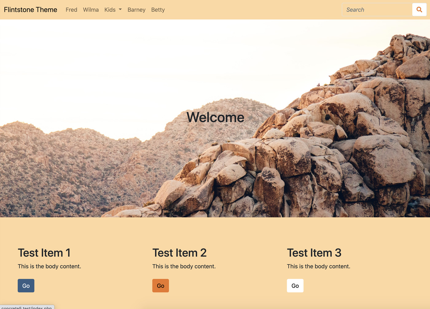
It worked! Our body background color is using #ffd89f, our primary color is #375d84 (which we can tell from the primary button we added), our secondary color is #eb7724 (which we can tell from the secondary button we added), and our light color is #fff (which we can tell from the light color button we added.)
Add a Custom Color
One of the neat features in Bootstrap 5 is the ability to add custom colors to their color maps. In doing so, you'll automatically add different permutations of the color to stock Bootstrap conventions like buttons and alerts. Let's add a fun color, and default it to the color of Fred Flintstone's dinosaur pet. The purple/pink color in this image is #ec008c. So let's add add our fun color to the bottom of _variables.scss:
$primary: #375d84;
$secondary: #eb7724;
$light: #fff;
$body-bg: #ffd89f;
$fun: #ec008c;
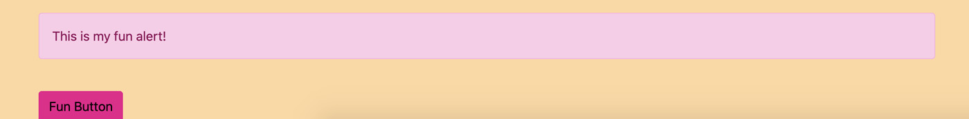
Now, let's add an HTML block to the page that references our new custom color, and put this HTML in it
`<div class="alert alert-fun">This is my fun alert!</div><br><button class="btn btn-fun">Fun Button</button></div>`
Adding this to the page results in something underwhelming:

Why is this? We can't just define a random color and expect Bootstrap and Bedrock to know anything about it. We haven't done anything with the $fun variable that would instruct Bedrock/Bootstrap that it should use this color to generate new alert and button variants. To do that, we need to add it to the Bootstrap $custom-colors SASS map. This is a SASS map that ships with Bootstrap; Bootstrap checks it at compile time and adds any entries into its theme colors collection, which it uses to build variants of buttons, alerts and more.
So let's add this to our _variables.scss file:
$custom-colors: (
    "fun": $fun
);
Next, we need to merge our $custom-colors directive into $theme-colors, which is what Bootstrap uses to build the various variants. This doesn't happen automatically. We'll add this line after out $custom-colors map:
$theme-colors: map-merge($theme-colors, $custom-colors);
Unfortunately, if you do this you'll get an error – because we haven't defined $theme-colors (since it ships as part of Bootstrap's variables file which we haven't included yet.) So let's take a moment to explicitly map the variables that we're overriding here into $theme-colors as well. This isn't always necessary, but in this custom color use case it is.
$theme-colors: (
  "primary": $primary,
  "secondary": $secondary,
  "light": $light
);
So our final file looks like:
$primary: #375d84;
$secondary: #eb7724;
$light: #fff;
$body-bg: #ffd89f;
$fun: #ec008c;

$theme-colors: (
  "primary": $primary,
  "secondary": $secondary,
  "light": $light
);

$custom-colors: (
  "fun": $fun
);

$theme-colors: map-merge($theme-colors, $custom-colors);
Important: This is all a little confusing, but it's important to remember that very little of this is Concrete-specific; we're using tested, documented SASS conventions in the popular Bootstrap library. That means Bootstrap will have a significant amount of documentation covering these use cases. I highly recommend the Bootstrap 5 Customization Documentation.
View the Result
Finally, ensure that your file is built properly. If you've encountered any errors along the way your npum run watch process may have faltered, so cancel it and re-run it with npm run watch, and let's check the result:
It worked! We now have a dynamically generated fun variant of both the alert and the button!
Register Custom Color with the Concrete Color Collection
Finally, before we leave the exciting world of SASS colors momentarily, let's take a moment to explore how we might add this new color of ours to Concrete editors – not just those savvy enough to know about a particular custom class we may or may not have made available in the theme.
Color Collections
In Concrete CMS 9, we introduced the ability for a theme to define a color collection. By default this collection is empty, but by implementing the BedrockThemeTrait, we've opted into the default color collection. This is that collection, which is defined at the PageTheme class level:
primary: Primary
secondary: Secondary
light: Light
dark: Dark
This is a simple key/value map – the key corresponds to the class in the theme, and the value corresponds to the name of the color in the collection. By implementing this, we add support for color selectors to block types like the Feature Link block, which can specify buttons:
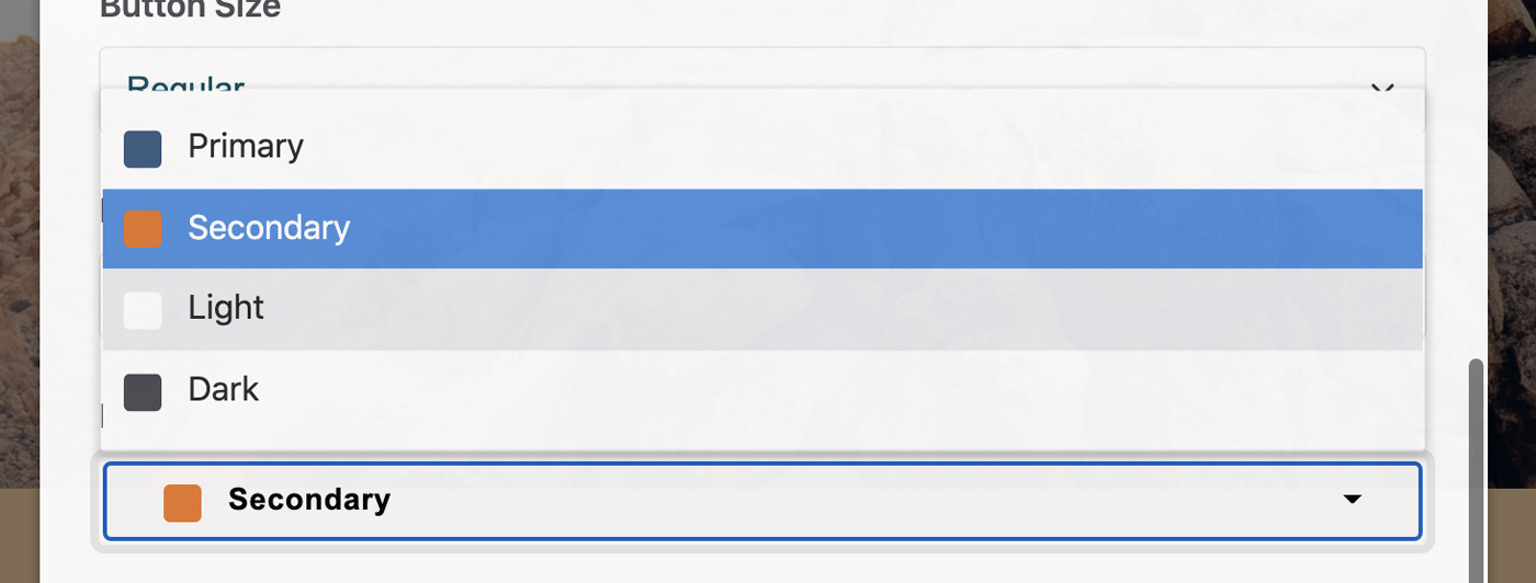
The BedrockThemeTrait has automatically specified these four button colors, and the button colors are automatically inherited from our customizations made in the theme. So let's add support for our new Fun button type.
Within application/themes/flintstone/page_theme.php, let's override the getColorCollection method found in BedrockThemeTrait with one that has our custom button in it. First, add two new classes to the imports at the top of the file:
use Concrete\Core\Page\Theme\Color\Color;
use Concrete\Core\Page\Theme\Color\ColorCollection;
Next, modify the use BedrockThemeTrait to allow for the overriding of the trait method. This allows us to call the trait's getColorCollection method and modify it with our own version.
use BedrockThemeTrait {
    getColorCollection as getBedrockColorCollection;
}
Finally, let's implement our own getColorCollection method.
public function getColorCollection(): ?ColorCollection
{
    $collection = $this->getBedrockColorCollection();
    $collection->add(new Color('fun', t('Fun!')));
    return $collection;
}
What's happening here? We've called the original trait's getColorCollection method (which we have renamed at runtime as getBedrockColorCollection), and we've added our fun color to it. Let's check our Feature Link block now:
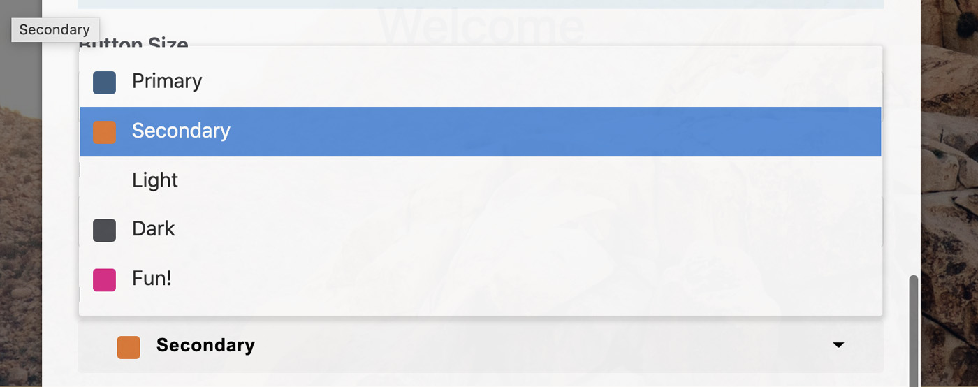
That's it! We've added "Fun" to our color collection. We can choose this button type within Feature Link and any other block types that support the color collection input.