Background
Version 8 of Concrete CMS brings a focus on ease of use and elegant information presentation to the Dashboard and administrative pages in Concrete. As larger organizations choose to depend on Concrete for running complex multi-site web presences, a consistent and easy to pick up backend to compliment our intuitive in-context editing is key.
As with everything, this is an iterative process where we expect to reach our goals over many months and version releases. We know there will be exceptions to these rules and scenarios this document does not yet cover. This style guide does describe base choices that should be used as a consistent starting point.
Creative Direction
You will notice a strong nod towards Google’s material design and the flat form treatment. The goal here is to show people the information they need, when they need it. Anyone using a form is trying to accomplish a real world goal (eg: post a calendar event.) They’re not trying to learn how to use a complicated form. Too often in the past form design has been left as an afterthought with everyone involved simply adding fields to white space as the mood strikes them. This leaves the end operator starting fresh every time they visit a new form. It makes them focus on learning the tool, rather than accomplishing the job.
This new style guide’s goal is to make the form experience clean and simple:
Ask one question at a time, like an interview. Don’t throw fields * everywhere in a futile attempt to keep things ‘above the fold.”
Responsive first. These forms should naturally behave in small widths and large widths consistently.
Input vs. Output. Any time the system is asking a question that should feel different than the response to that question.
Design Rules
Basic Input Design
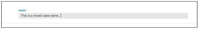
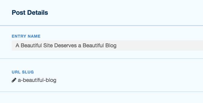
- Labels are all caps, in blue.
- Inputs are mixed case, in grey.
- Labels go above text fields, not next to them.
- A full width line separates one field from the next.
Implementation
If you adhere to Bootstrap 3 form markup (http://getbootstrap.com/css/#forms) your inputs will automatically look this way, provided they come within block dialogs or Dashboard pages.
Save/Cancel
The save bar now floats at the bottom of your browser if the content is long enough.
Cancel should always be grey on the left.
Save Changes should be used instead of Save. It should be green.

If additional options are available for committing your work (save vs. publish) they should be stacked on the right with the option having the biggest impact the furthest to the right.
If there are more than one way to leave this page without causing any changes to the live site, they should be stacked on the left.

Implementation When creating Dashboard pages, just wrap your buttons in the ccm-dashboard-form-actions-wrapper and ccm-dashboard-form-actions classes. For example:
<div class="ccm-dashboard-form-actions-wrapper">
<div class="ccm-dashboard-form-actions">
  <button class="pull-right btn btn-primary" type="submit" ><?=t('Save')?></button>
</div>
</div>
Section Titles
 Attribute sets, or form group titles get a bolder title treatment and 2px line (still full width). To create this bolder titles, simply use the
 <legend> tag within a <fieldset> block.
Tool Tips
A green underline on a label indicates there’s a tool tip available if you roll over that title.
Implementation
Here is an example of the markup that creates this styled tooltip in a Dashbord page.
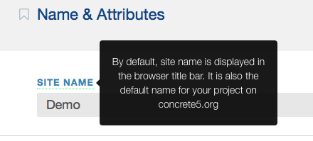
<label for="SITE" class="launch-tooltip control-label" data-placement="right" title="<?=t('By default, site name is displayed in the browser title bar. It is also the default name for your project on concrete5.org')?>"><?=t('Site Name')?></label>