Now, let's do something more advanced. Since we're now in full control of the SCSS and JavaScript used to render these block types, let's add some fancy behavior to the a block that's part of the Imagery suite. I'm partial to a simple parallax effect when scrolling down a page, so I'm going to add that behavior to my Hero Image block. The Hero Image block (new in version 9) is a natural candidate for this functionality, because it's made for placing large images at focal points in the page.
There are many ways to add this type of functionality to a theme – this is just one of many. I'm going to implement this parallax functionality with the Simple Parallax custom JavaScript library.
Add Hero Image to a Page
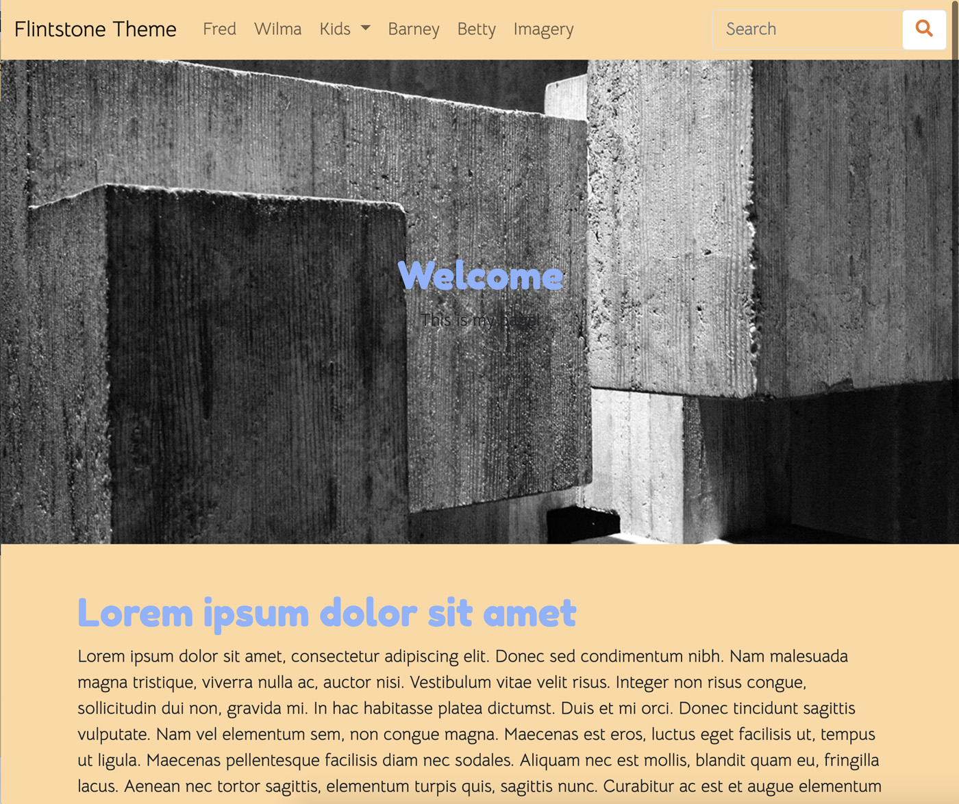
First, let's add an instance of Hero Image to a page.

This is looking acceptable, but the dark text on our dark image isn't great. Obviously, this is kind of an aesthetic problem – because if we were to use mostly light images we would have the opposite problem. However, let's say in our theme we have the guideline that we want to use dark images like this picture of concrete. In that case, we're going to want to make it so that the subheadings and paragraphs of the Hero Image block render in a color different than the base typography of the page. So let's add some custom SCSS for the Hero Image block to our theme to better render with our choice of images.
Add Custom SCSS for the Hero Image Block to Theme
Within our _imagery.scss file, let's add a directive that imports custom stylesheets just for our instance of the Hero Image block type. Within the empty imagery directory we've made, let's add an SCSS partial file for the Hero Image block, named _hero-image.scss.
Next, let's add an import of this file to our _imagery.scss partial, which is already being imported by main.scss. With this import added, our _imagery.scss file should look like this:
// Import base stylesheets
@import "@concretecms/bedrock/assets/imagery/scss/frontend/frontend";

@import "imagery/hero-image";
Now, let's add some custom styles to our Hero Image partial that will make the subheading look a bit more pleasing in our theme. Within _hero-image.scss, add these styles:
div.ccm-block-hero-image {

  div.ccm-block-hero-image-text {
    color: $body-bg;
    font-size: 2rem;

    h1 {
      font-weight: 700;
      margin-bottom: 0;
      font-size: 4rem;
    }

    h1, h2, h3, h4, h5, h6 {
      text-align: center;
    }

  }
}
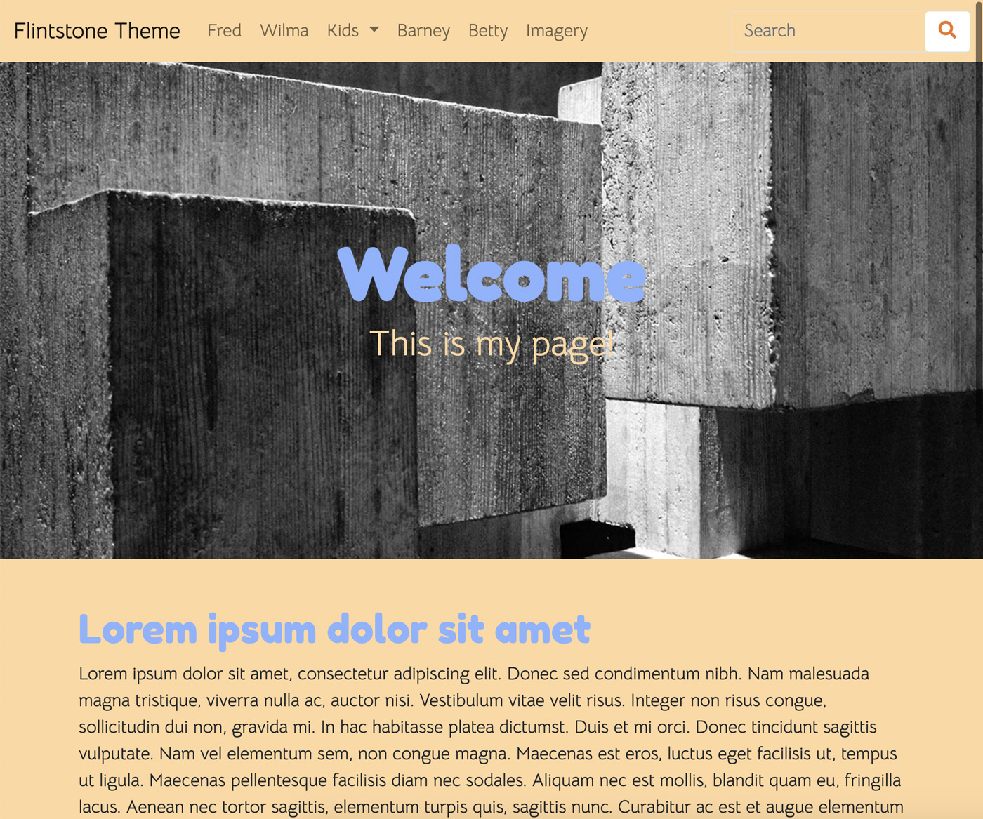
Here, we're adding custom SASS that targets just the HTML provided by the Hero Image block type. We set the color of the text inside Hero Image to that of the $body-bg variable (which is the tan color we've already specified in our _variables.scss file). Next, we up the font size to make the whole thing more exciting. Here are the results:

Now that we've made the Hero Image look a bit nicer, let's add our desired parallax effect.
Add the Simple Parallax Library
Since the Simple Parallax library is distributable via npm just like Bedrock, let's use npm to install it. From within the root of your theme build directory (where your theme's package.json resides), add the Simple Parallax library. These are instructions found on simpleparallax.com.
npm i simple-parallax-js
This will add Simple Parallax to package-lock.json, and download the relevant library into the node_modules/ directory.
Add Simple Parallax to main.js
Next, we need to import Simple Parallax into our theme's main.js file. Add this to your main.js.
import simpleParallax from 'simple-parallax-js';
After this import, you can follow the instructions from simpleparallax.com to activate Simple Parallax. Instead of running this on general img tags, instead we're going to just run it on the presentation DIV that's part of the standard Hero Image block view template:
// Add parallax support to all Hero Image blocks
var images = document.querySelectorAll('.ccm-block-hero-image-image');
new simpleParallax(images, {scale: 1.5});
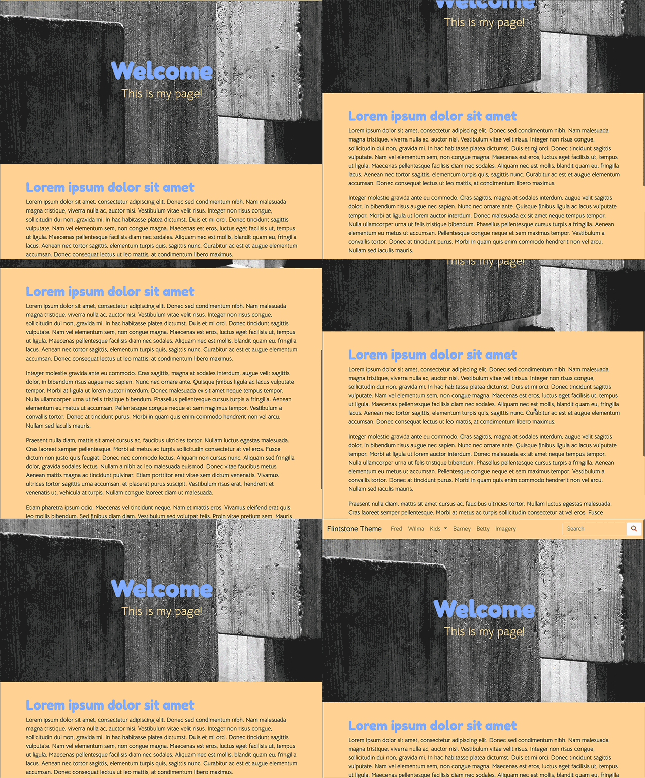
Saving the block and re-running npm run production results in success!

Now let's do something even more adventurous – let's change the entire behavior of the Image Slider block.