One of the things that could be improved in our theme is the spacing between elements. In modern website design, sections of content are frequently crafted together, and with significant amounts of vertical space between them to draw attention to the content groupings. Here, we don't have that, so some of our pages look bad.
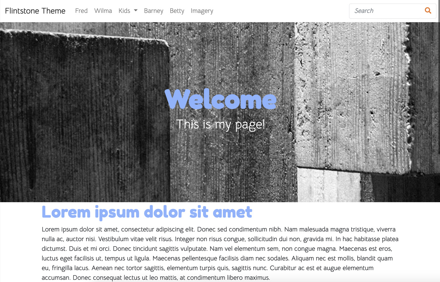
Yes, we could use the CMS to manually add space within the content blocks (that's what I'd done earlier), or we could use the inline design controls to add custom padding at the block type or area level – but without uniformity our site is going to start looking really ugly over time. One editor might add 50 pixels of space after a content element, another might add 80, or another might add 2rem, etc...
Let's create a more uniform solution.
Remove Custom Skins and Reset
First, let's remove any custom skins like our Powder Blue skin we added before, and go back to the stock theme. We want to do this because we want to test default skins as well as our customizer as we add this new functionality.
Container Margin-Y
Let's add a new variable named $container-margin-y. This adopts the Bootstrap naming convention for variables of this type. We must add this variable to both preset _customizable-variables.scss files. Here's what presets/default/_customizable-variables.scss looks like:
$primary: #375d84 !default; $secondary: #eb7724 !default; $light: #fff !default; $body-bg: #ffd89f !default; $fun: #ec008c !default;
// Spacing variables $container-margin-y: 3rem !default;
(Don't forget to add !default to the declaration.)
Add New _container.scss partial
Next, let's add a new _container.scss SASS file within our theme.
_container.scss
// Page level element choices
.ccm-page {
  > div.container {
    // The goal of this – any page level objects like layouts or blocks wrapped in a container that are NOT Concrete
    // containers should have automatic padding. Without this you have to add tons of custom design CSS within the block
    // design tool
    @include rfs($container-margin-y, 'margin-top');
    @include rfs($container-margin-y, 'margin-bottom');
  }

  // Let's add the same spacing even in edit mode.
  div[data-container=block] {
    > div.container {
      margin-top: $container-margin-y;
      margin-bottom: $container-margin-y;
    }
  }

}
This looks confusing but let's break it down. First, we have two declarations here. The first is meant to target all DIVs with the container class, provided they're the first-child of the .ccm-page outer element. This basically is giving high level container DIVs extra margin.
We could just add margin-top and margin-bottom here, but instead we're using the rfs() mixin. rfs() is short for "responsive font size", and is basically just a way to make size values that top out at a certain value, but get smaller as the viewport is resized. Basically, the 3rem will specify will be used on large viewports, but will get smaller as we scale down to smaller devices. I'm using it because it's a nice behavior, and it's also a good reminder that we have access to the fully complement of SASS behaviors and Bootstrap variables/mixins.
Finally, our second declaration here sets the same level of container margin in edit mode. In edit mode, lots of extra DIVs are added into the page – so our > selector in the first declaration will be ignored. We don't want to lose margin on these elements when we're in edit mode, so we'll add that second set of CSS to ensure that the same margin persists even when we're in edit mode.
Import _container.scss
Next, we have to import _container.scss. We can do that by adding it to _common.scss.
@import "shared-variables";

@import "@concretecms/bedrock/assets/bedrock/scss/frontend";

@import "container";

@import "features/imagery";
Build Skins
That should do it. Let's build our skins with npm run production and test them.
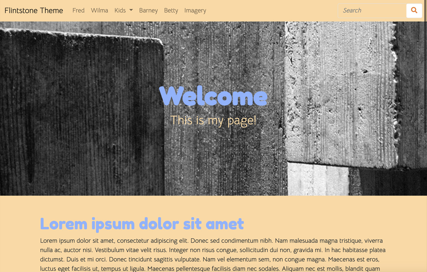
We now have adequate margin between the top level container elements.
Add to Styles XML
Since this value is part of the _customizable-variables.scss file, all we have to do to make it customizable is add it to styles.xml. We can do that by adding
<style name="Container Margin-Y" variable="container-margin-y" type="size"/>
to one of the style sets.
<?xml version="1.0"?>
<styles version="2.0" lang="scss">
    <set name="Base Colors">
        <style name="Primary" variable="primary" type="color"/>
        <style name="Secondary" variable="secondary" type="color"/>
        <style name="Light" variable="light" type="color"/>
    </set>
    <set name="Theme Custom Colors">
        <style name="Fun" variable="fun" type="color"/>
    </set>
    <set name="Body">
        <style name="Background" variable="body-bg" type="color"/>
        <style name="Container Margin-Y" variable="container-margin-y" type="size"/>
    </set>
</styles>
Test Customizer
Let's test the customizer.
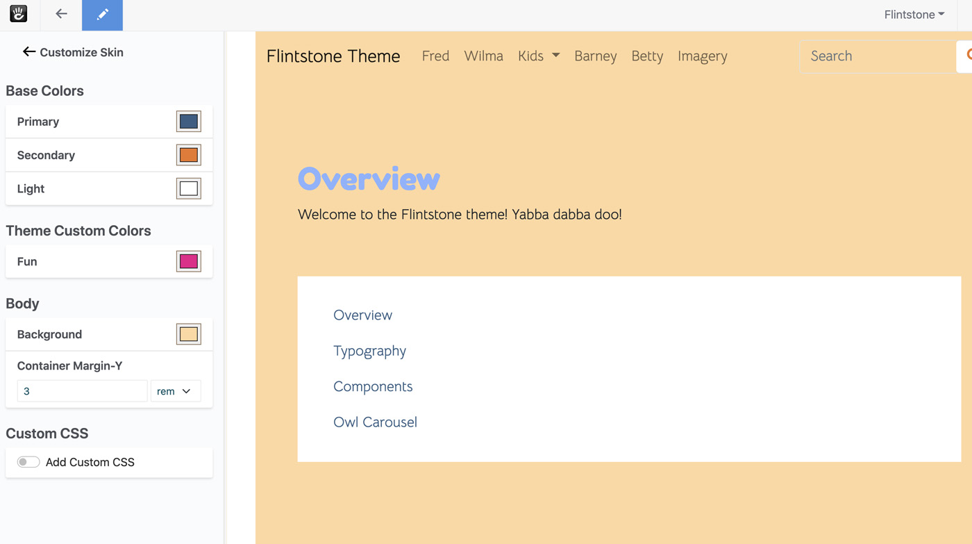
Our value is being pulled in properly, and populated with the correct default value. Let's change it to something huge, like 6rem
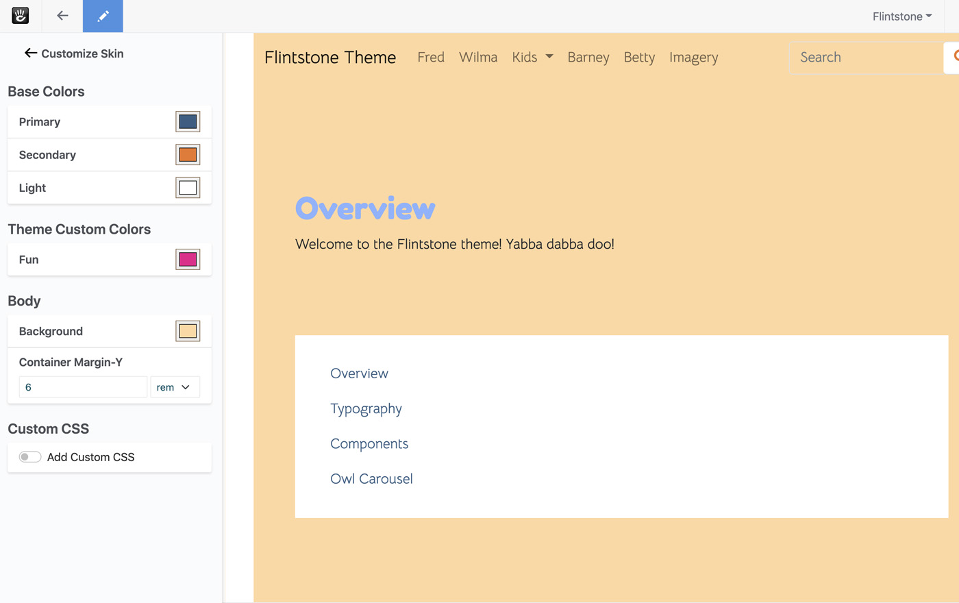
It works! Our page reloads the moment we change the value, and we get double the space between our containers.
Conclusion
That's it! We've added a size style to our theme, and used it to control how much space exists between a container. We've even made it suitably responsive through the use of the rfs() mixin. Next, let's add some Font Family controls to our theme to give editors the ability to choose what font families they'd like for the body font.