In order to enable customization for a theme, a file named styles.xml must be present within the theme's css/ directory. This has been the case since the creation of the 5.7 customizer.
Let's create such a file, then walk through how it works.
<?xml version="1.0"?>
<styles version="2.0" lang="scss">
    <set name="Base Colors">
        <style name="Primary" variable="primary" type="color"/>
        <style name="Secondary" variable="secondary" type="color"/>
        <style name="Light" variable="light" type="color"/>
    </set>
    <set name="Theme Custom Colors">
        <style name="Fun" variable="fun" type="color"/>
    </set>
    <set name="Body">
        <style name="Background" variable="body-bg" type="color"/>
    </set>
</styles>
The outer node of the file, <styles> must be present. The attribute version also must be present, and set to 2.0. In this way we can continue to support legacy versions of the customizer, where this version will not be present. Additionally, lang must exist, and should be set to scss. You may also set this to less if you'd like to use LESS to manage your stylesheets, but LESS is not used in Bedrock and is not a part of this tutorial.
Next, we can define one more sets of customizable styles. Sets are just named groups of styles. Each style directive has a name, which is human-readable, a variable that maps to a SASS variable in your _customizable-variables.scss file, and a type. The following types are available (more on these different types in a minute).
- Color
- Font Family
- Font Style
- Font Weight
- Image
- Size
- Text Decoration
- Text Transform
There is also one additional style type, Type, which acts a container style. More on the Type style can be found here.
In our example above, we're grouping all our customizable styles into a few sets. Since all of our customized styles are currently colors, they all have the type="color" attribute. Finally, their variables map to the exact variable name in the customizable-variables.scss file. (Note: earlier versions of the customizer did not work this way, with variable names always having their types as suffixes. That is no longer required, and should lead to much more flexible stylesheets that work with third party libraries. For example, now it's possible to set the Bootstrap core variables with the customizer.)
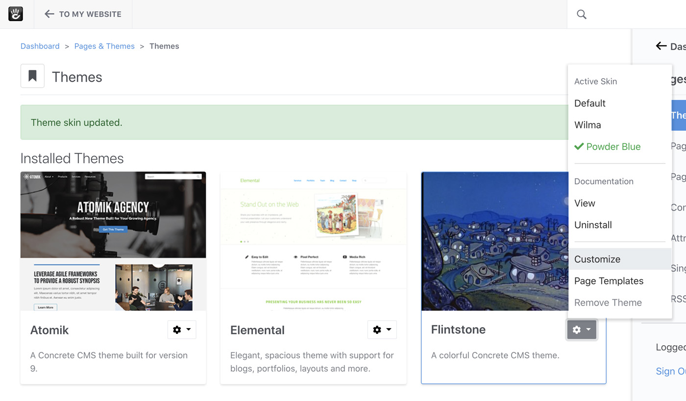
With this styles.xml in place, let's see our customize in action.
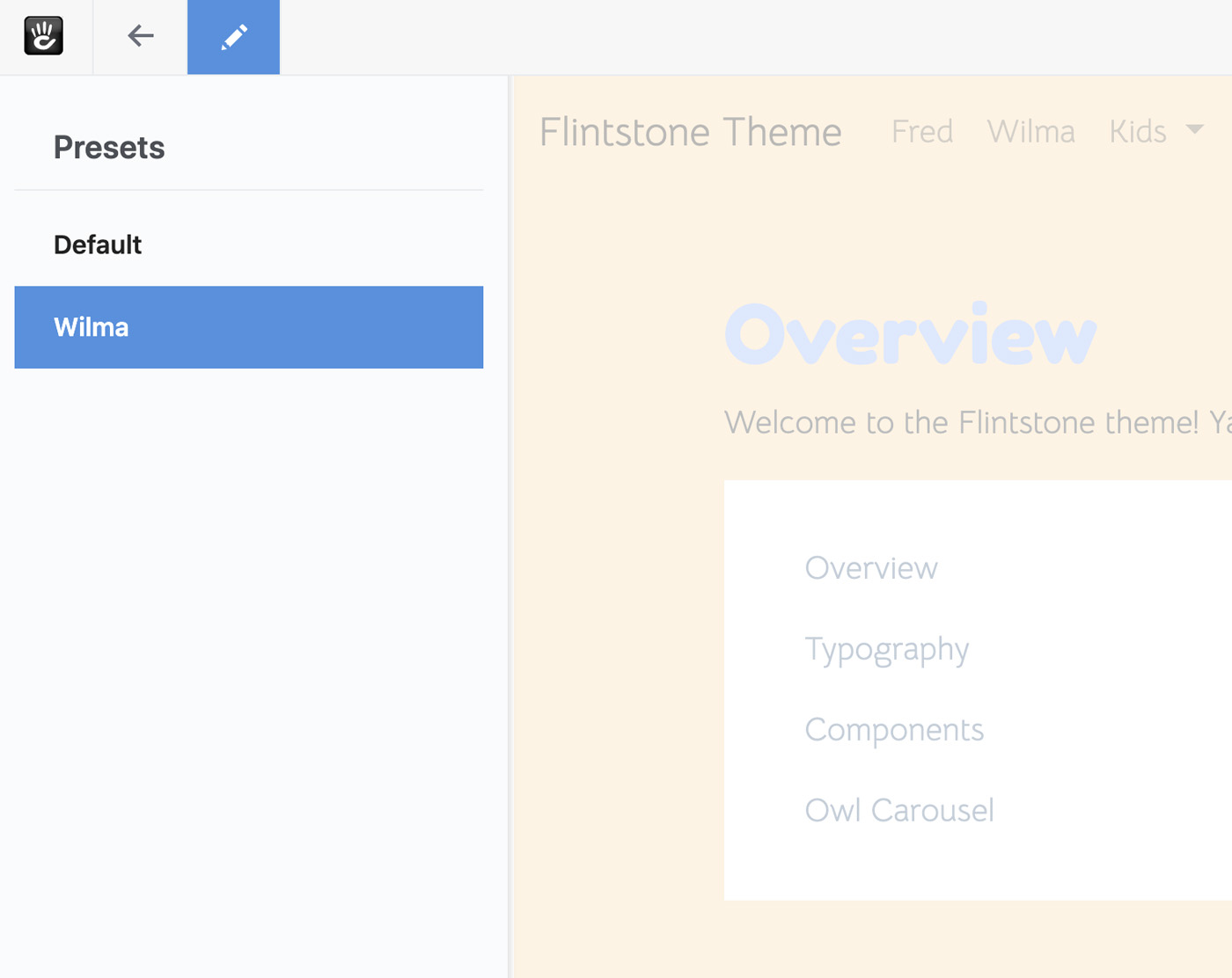
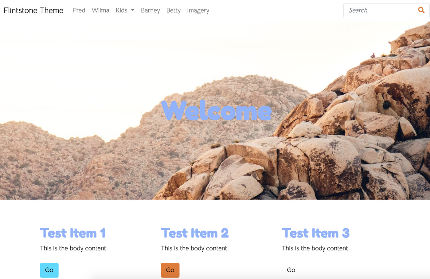
Looking good so far! Our colors are loading in from their defaults into the proper styles in the panel. Let's change some colors, and save a new skin.
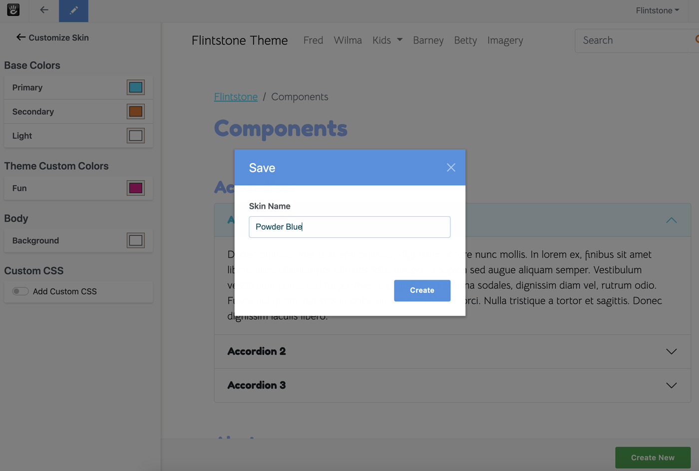
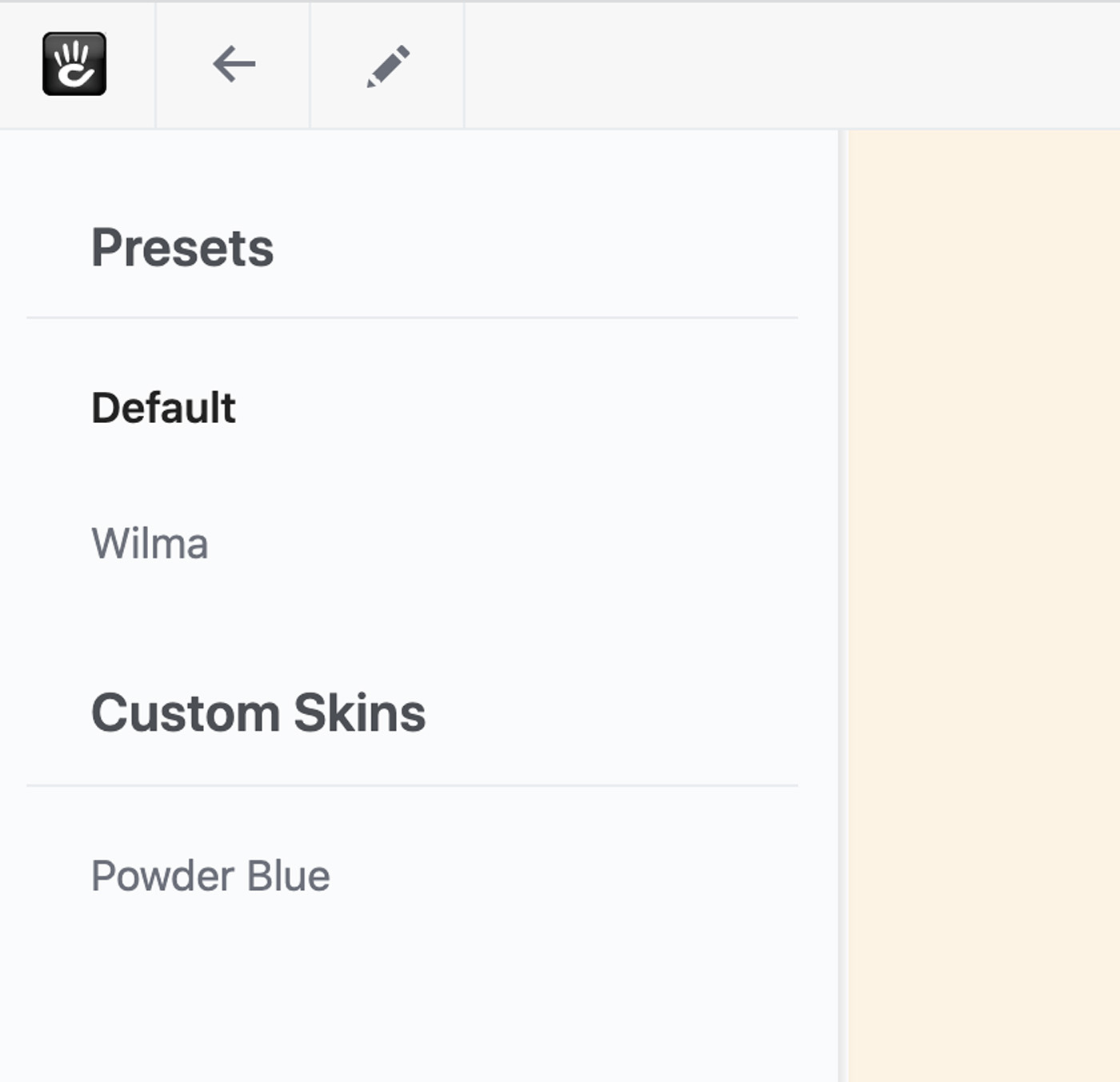
The new skin should show up in the panel, and everywhere else skins are listed.
Skins are compiled down completely, so the moment you switch to it your site should still be very fast. No need to wait while the compiler runs on the frontend. Switching to the new skin should be instantaneous.
We've done it! We've made our theme customizable. We could stop here, but before we finish up let's add a custom different types of styles to our theme. Up next, let's add some customizable spacing between sections using the Size type.