In older versions of the customizer, all type-related customizations had to be made through a single Type style, which controlled multiple LESS variables for color, font family, etc... This was pretty inflexible, and made it impossible to do things like create a variable that just controlled Font Family (like we just did). The new customizer is much better in this regard.
However, there are some times that it becomes desirable to have a container style like Type. For example, if we want to give users the ability to change the color, font family and font weight of the headings in their site – which are the three parameters we've customized up to this point – it's nice to group these controls together, rather than rely on them being three separate customization points. It saves space and makes for easier training.
With that in mind, let's create a Type style that groups these three styles together into one property.
Modify _shared-variables.scss
These are the styles in _shared-variables.scss that we're going to be making customizable.
$headings-font-family: "Fredoka One";
$headings-color: $light-blue;
$headings-font-weight: 400;
So let's remove them from _shared-variables.scss first.
Add Customizable Styles
Copy Light Blue Color
We're going to need to copy our $light-blue value from _shared-variables.scss into our _customizable-variables.scss file, because we don't have access to it as as variable any longer in _customizable-variables.scss.
Once we copy that SCSS, and the light blue value as well, let's add the customizable styles to each skin's _customizable-styles.scss file. Here's what presets/default/_customizable-variables.scss looks like:
$primary: #375d84 !default;
$secondary: #eb7724 !default;
$light: #fff !default;
$body-bg: #ffd89f !default;
$fun: #ec008c !default;

// Spacing variables
$container-margin-y: 3rem !default;

// Body Font
$font-family-base: "Bellota Text" !default;

// Headings
$headings-font-family: "Fredoka One" !default;
$headings-color: #8bb2ff !default;
$headings-font-weight: 400 !default;
Don't forget to add this to the Wilma skin as well, and to add !default to every declaration.
New SASS
We don't even have to add any new SASS or SASS imports, because all of this is already handled by Bootstrap 5, since this is one of their variables.
Build Skins
Let's rebuild the skins to verify that the customizer still works.
npm run production
Add to Styles XML
Now we have to add our headings to the styles.xml.
<style name="Headings" variable="headings" type="type"/>
to one of the style sets.
<?xml version="1.0"?>
<styles version="2.0" lang="scss">
    <webfonts>
        <preset identifier="default">
            <font type="google" name="Fredoka One" />
            <font type="google" name="Bellota Text" />
        </preset>
        <preset identifier="wilma">
            <font type="google" name="Fredoka One" />
            <font type="google" name="Bellota Text" />
        </preset>
    </webfonts>
    <set name="Base Colors">
        <style name="Primary" variable="primary" type="color"/>
        <style name="Secondary" variable="secondary" type="color"/>
        <style name="Light" variable="light" type="color"/>
    </set>
    <set name="Theme Custom Colors">
        <style name="Fun" variable="fun" type="color"/>
    </set>
    <set name="Body">
        <style name="Background" variable="body-bg" type="color"/>
        <style name="Container Margin-Y" variable="container-margin-y" type="size"/>
        <style name="Headings" variable="headings" type="type"/>
        <style name="Base Font Family" variable="font-family-base" type="font-family"/>
    </set>
</styles>
Important! Make sure to look closely here. Unlike every other variable, the Type variable does not match the variable in use in the file. That's because the Type style is a container style – the variables found in the SCSS files actually a combination of the variable as defined in the styles.xml file, and different suffixes. Since we've named the variable "headings" in the styles.xml, the Type Style style parser will be looking in our _customizable-variables.scss file for the following styles.
- headings-font-family
- headings-font-size
- headings-font-style
- headings-font-weigh
- headings-color
- headings-text-decoration
- headings-text-transform
Since we've provided three of them, those should automatically be loaded in our customizer – while all the rest of the controls should be omitted. Let's check it out.
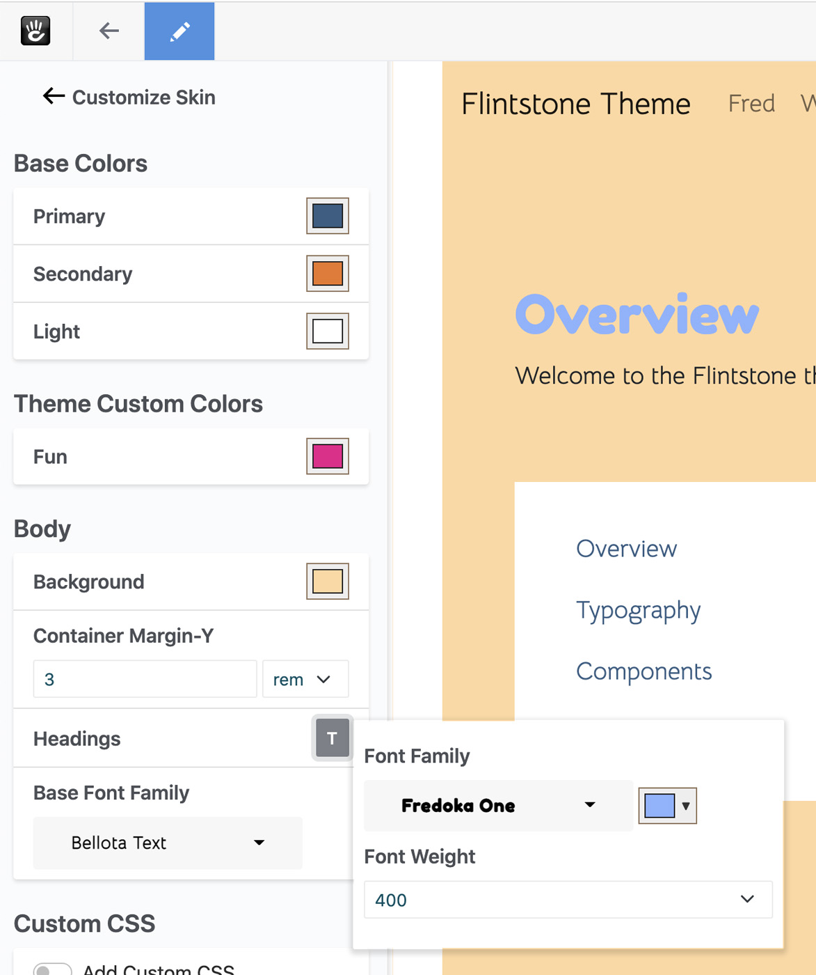
It works! Our value is being pulled in properly, and populated with the correct default values. Clicking the Type button next to the style populates a flyout menu with just the styles we want, correctly loaded. We get the proper light blue, the proper Fredoka One font (correctly rendered) and the proper font weight as well.
Let's change these values and test.
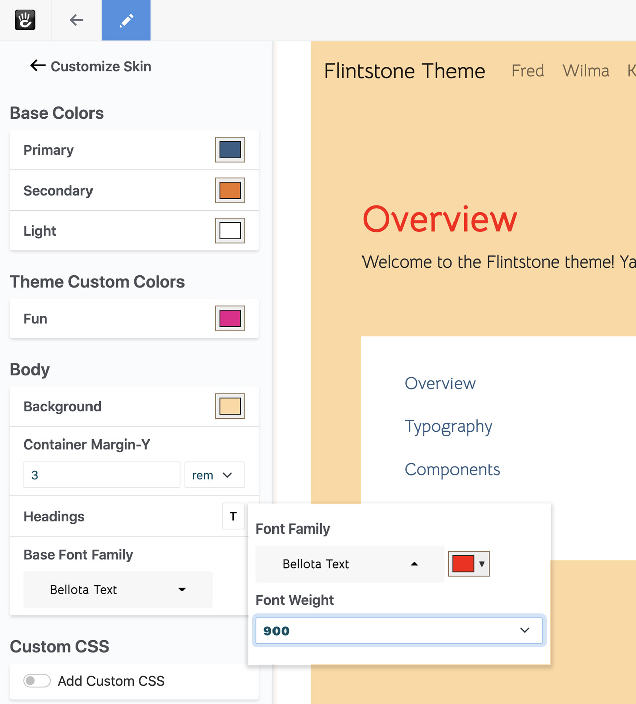
It works! Our page reloads the moment we change any of the values, and they all affect the customized version of the theme.
Conclusion
Hopefully this has given you a good introduction to the Concrete CMS 9 theme customizer. We're really proud of the functionality present here, and can't wait to see what theme developers do with it. We've really tried to remove some of the limitations of past versions of the customizer, and built a solid foundation for years to come.