Adding a Document Library Block to a Page and Configuring It
When you add the document library to a page, the block edit modal will appear. It is broken into three different sections - Sources, Header, and Results.
The Sources Tab
The Sources Tab contains controls to help determine what files should be included in the document library and how the end users should be allow to interact with the Document Library.
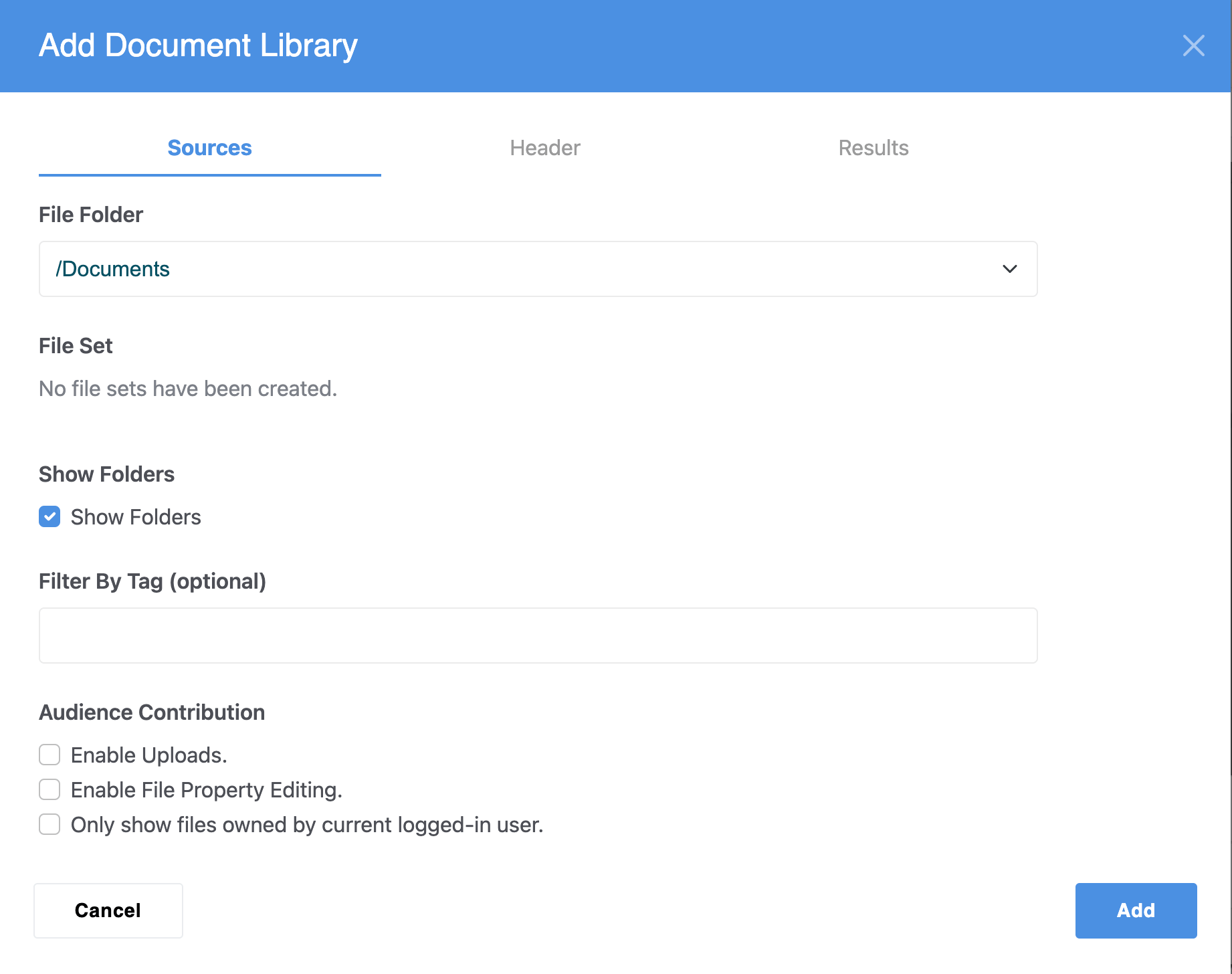
File Folder - Specifying a file folder allows you to limit the document list to only files within a specific folder in the file manager.
File Set - This allows you to only list files placed in a specific file set (if there are any created).
Show Folders - This allows end users to see the folder structure that the selected files your are displaying are stored in. Turning it off will just show a flat list of files.
Filter By Tag - This allows you to only show files that have a tag attribute with a specific value to be shown, e.g. if you apply a tag attribute of "sales figures" to 5 spreadsheets, only those files would be shown.
Audience Contribution - These are controls that enable the audience to contribute to your file library. As always with any audience contribution, be sure you can trust your user base before enabling options that allow users to upload or modify files.
- Enable Uploads - allow end users to upload files to the document library
- Enable File Property Editing - allow users to edit properties of files, such as the file title.
- Only show files owned by current logged-in user - this will display only the files that the currently logged in user has uploaded to the File Manager.
The Header Tab
The header tab controls allow you to choose your default sort option, enable searching, and choose the display properties for your headings.
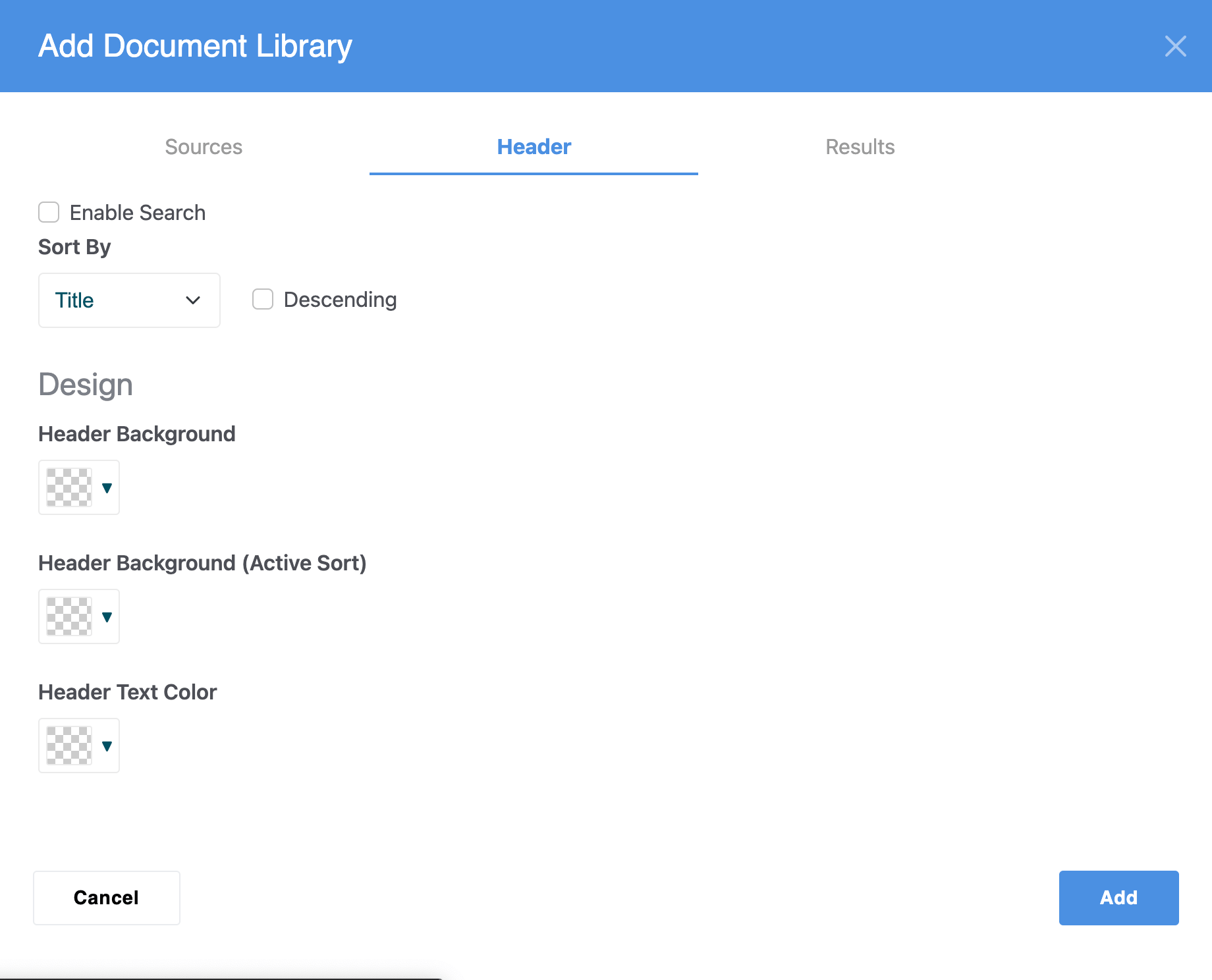
Enable Search - This displays a search field to the end user which allows them to use search queries to find documents in the Document Library.
Sort By - This allows users to choose how they want the Document Library to be sorted by default. It defaults to "Ascending" but ticking the "Descending" box will make it sort in descending order. The sort options are Title, Set Order, Date Posted, Filename, Width, Height, and Duration.
Header Background - This is a color picker that allows the background of the header to be customized. Note the header appears at the top of the Document Library View.
Header Background (Active Sort) - This is a color picker that allows the background of headings that are actively being sorted to be customized.
Header Text Color - This is a color picker that allows the Header Text Color to be customized.
The Results Tab
The Results Tab controls allow you to configure how the results section of your Document Library Block will appear to end users. Strap in, it's a long one!
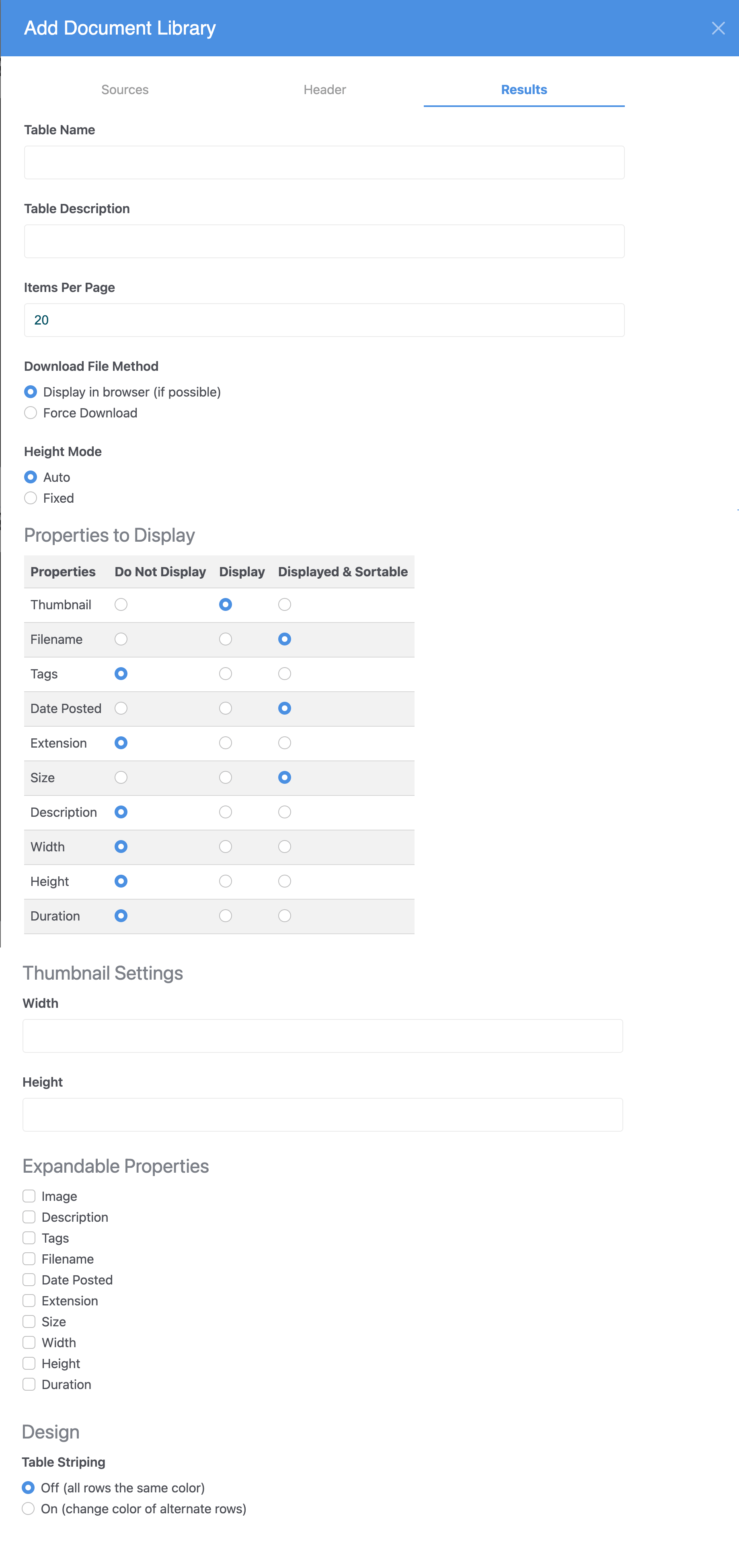
Table Name - The displayed title of the table
Table Description - The displayed description of the table
Items per page - How many items will be be displayed on one page of the Document Library display before the end user will need to page to the next page of results.
Download File Method - Choose "Display in Browser (If Possible)" to allow the file to be viewed in the browser if it is able to be (e.g. open a PDF in the browser as opposed to downloading it) or choose "Force Download" to ensure the user will download the file when they click on it instead of viewing it in the browser.
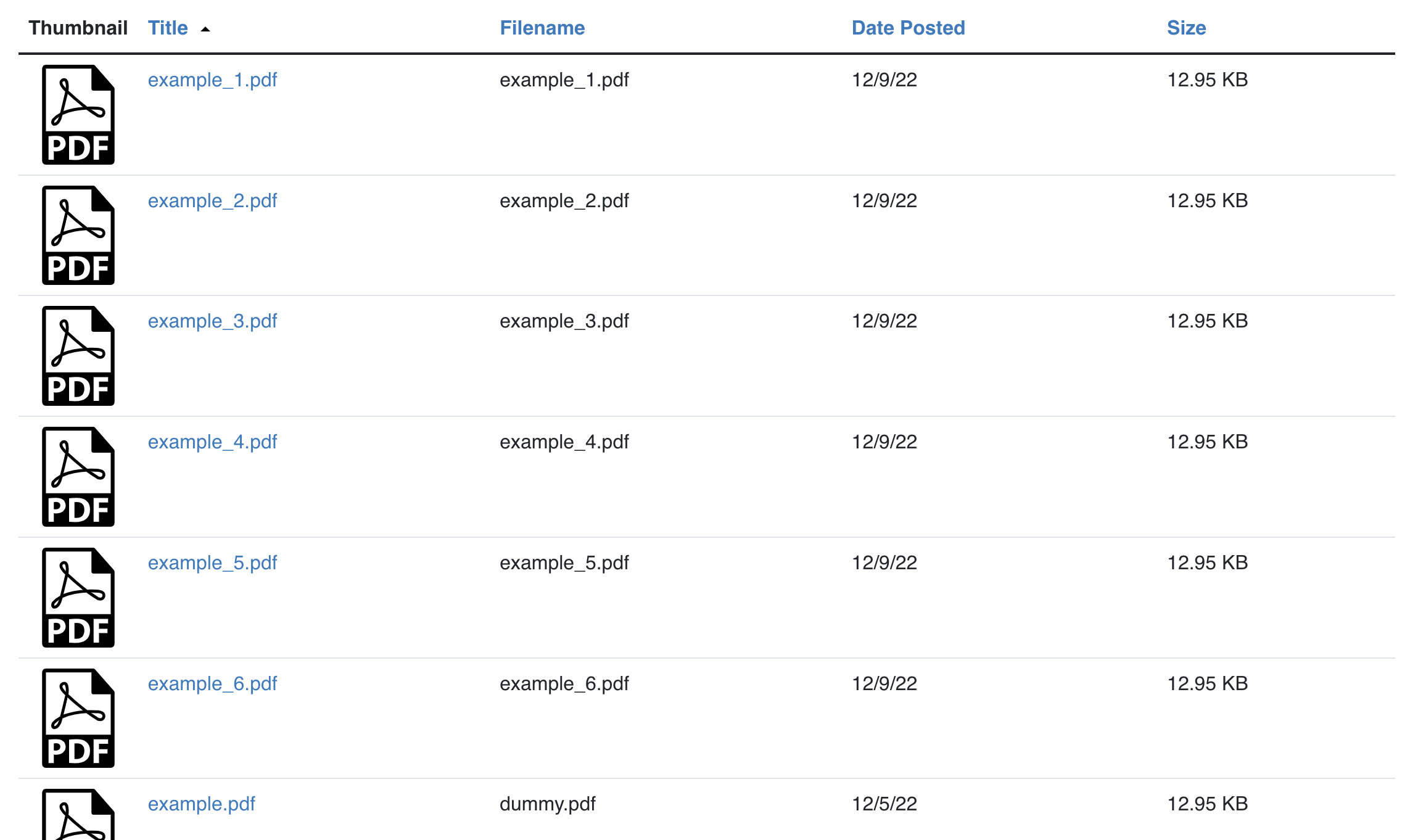
Properties to Display - Choose which properties of the documents should be displayed, and if they are displayed, whether the Document Library should be able to be sorted by those properties.
Thumbnail Settings (Width and Height) - Control the width and the height of the thumbnails shown in the Document Library.
Expandable Properties - If you have properties you don't think need to always be displayed but might be useful to view sometimes, you can create a "Details" drop down that can be expanded to show these "expandable properties" by choosing one or more properties to be expandable.
Table Striping (off / on) - Table striping defaults to off, which means all rows have the same background color. Choosing "On" will reveal a color picker where you can choose the background color of the alternate rows.