Enabling Customization
Customizization in Themes
Concrete CMS themes offer robust style customization, enabling editors and administrators to adjust CSS properties like colors, spacing, and fonts within the CMS.
Theme Customization Overview
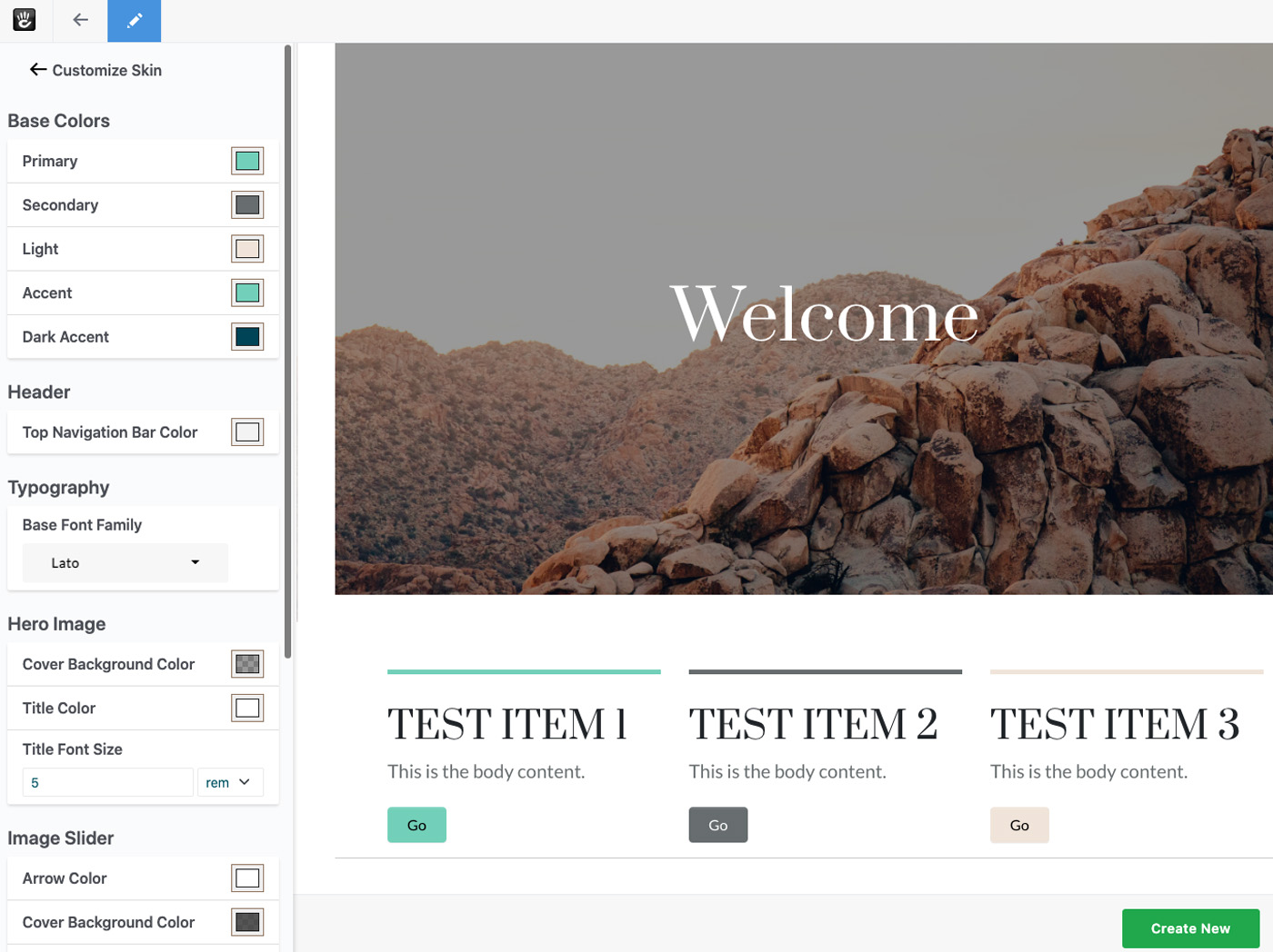
In-CMS Customization: Users can modify theme styles directly in the CMS.
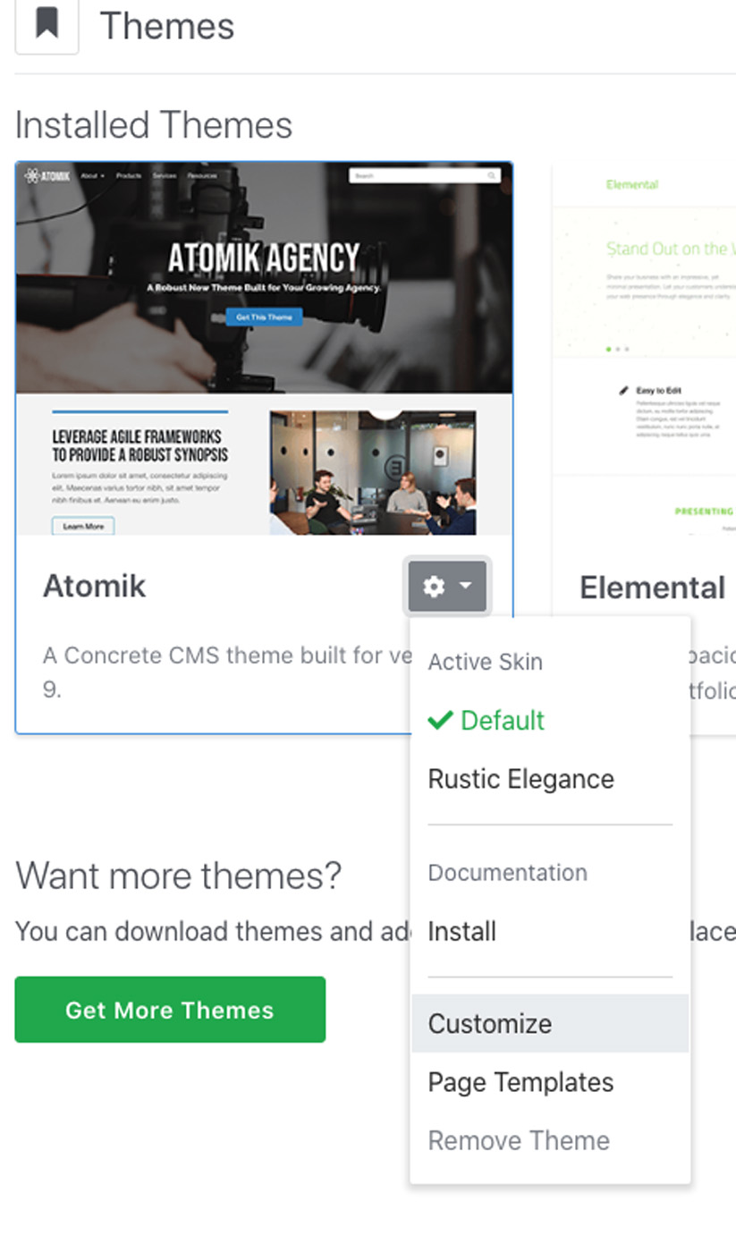
On-the-Fly Skin Creation: New skins can be created dynamically.
Utilizing Bedrock
Bedrock, while not mandatory, provides an efficient file structure for handling customizable presets. It's especially useful for creating and managing themes with customizable elements.
Optimizing for Customization
We've updated our Flintstone theme with two skins and can now streamline its structure for better efficiency and customization. Here's an overview:
Directory Structure: The
assets/scssdirectory currently holds individualmain.scssand_variables.scssfor each skin.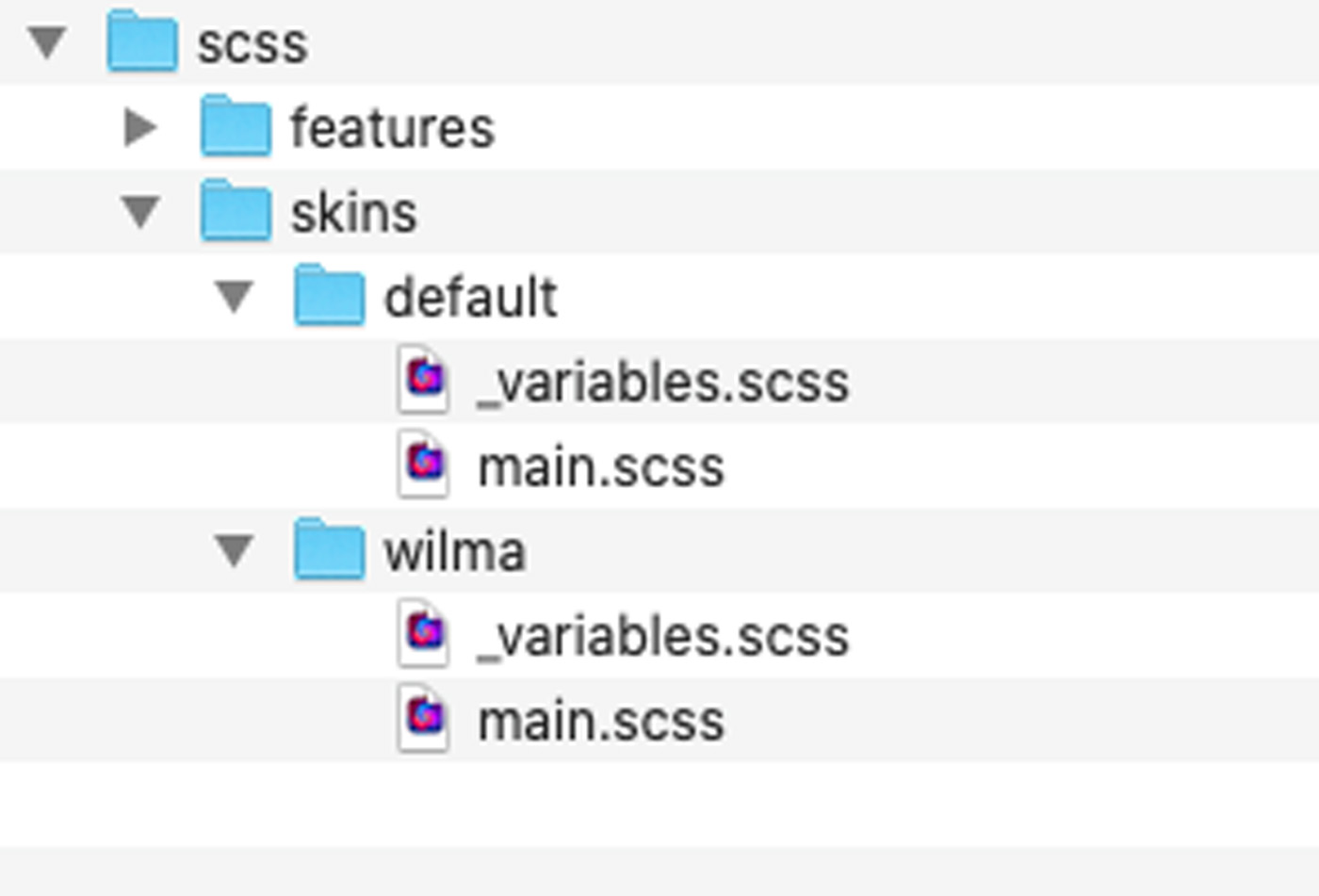
Variable Categorization: We categorize variables as customizable, non-customizable, and shared. Customizable ones are modifiable via the customizer, non-customizable are unique to each skin but not modifiable, and shared variables are common across all skins.
Refactoring: We moved
main.scsscontents to_common.scssat the root for shared usage.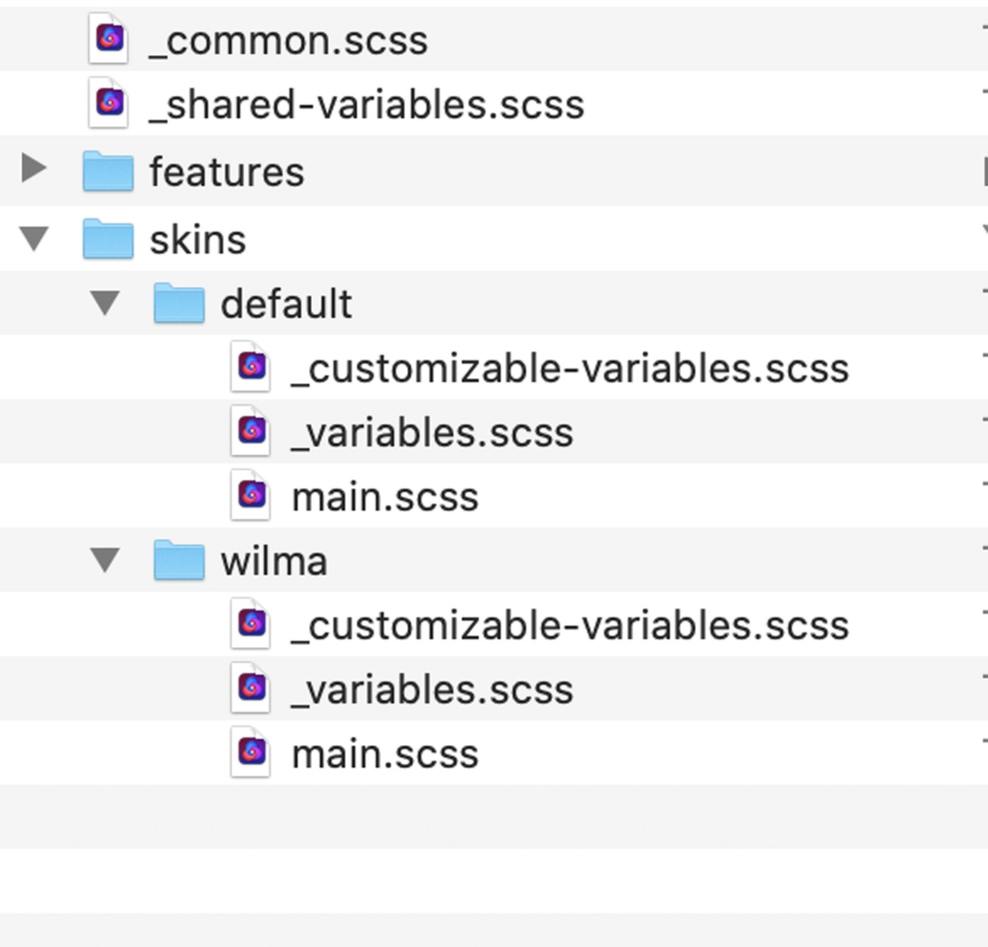
Updated Files
skins/default/main.scss
@import "customizable-variables";
@import "variables";
@import "../../common";
skins/default/_customizable-variables.scss
$primary: #375d84;
$secondary: #eb7724;
$light: #fff;
$body-bg: #ffd89f;
$fun: #ec008c;
skins/default/_variables.scss
- This file is now empty as all variables are either customizable or shared.
_common.scss
- Contains what was in
main.scss.
@import "shared-variables";
@import "~@concretecms/bedrock/assets/bedrock/scss/frontend";
@import "features/imagery";
_shared-variables.scss
@import url(//fonts.googleapis.com/css?family=Fredoka+One);
@import url(//fonts.googleapis.com/css2?family=Bellota+Text:wght@400;700&display=swap);

$light-blue: #8bb2ff;

$theme-colors: (
    "primary": $primary,
    "secondary": $secondary,
    "light": $light
);

$custom-colors: (
    "fun": $fun
);

$theme-colors: map-merge($theme-colors, $custom-colors);

$headings-font-family: "Fredoka One";
$headings-color: $light-blue;
$headings-font-weight: 400;

$font-family-base: "Bellota Text";
$font-weight-base: 500;
$font-size-root: 20px;
Final Step: Rebuild Assets
Run npm run production to rebuild assets. The theme is now optimized and compatible with the customizer.
Customizing Theme with styles.xml
Create styles.xml in the theme's css/ directory for customization. This XML file defines customizable style sets:
<?xml version="1.0"?>
<styles version="2.0" lang="scss">
    <set name="Base Colors">
        <style name="Primary" variable="primary" type="color"/>
        <style name="Secondary" variable="secondary" type="color"/>
        <style name="Light" variable="light" type="color"/>
    </set>
    <set name="Theme Custom Colors">
        <style name="Fun" variable="fun" type="color"/>
    </set>
    <set name="Body">
        <style name="Background" variable="body-bg" type="color"/>
    </set>
</styles>
Key Details
<styles>: Essential outer node withversion="2.0"andlang="scss".- Sets: Grouped styles with names, variables (from
_customizable-variables.scss), and types (e.g.,color).
Customization Types
- Color
- Font Family
- Font Style
- Font Weight
- Image
- Size
- Text Decoration
- Text Transform
Next, see customization in action and save new skins. Skins compile fully for immediate theme changes without frontend compiling.
Up next, add customizable spacing using the Size type.
Implementing Uniform Spacing with Size Style
Overview
To improve theme spacing, a uniform approach using $container-margin-y variable is implemented, instead of relying on manual or inconsistent edits. This ensures a consistent look.
Steps
Reset to Stock Theme: Remove custom skins like "Powder Blue" for testing defaults and customizations.
Add
$container-margin-yVariable: In both_customizable-variables.scssfiles, include this new spacing variable with!defaultsuffix.Create
_container.scssSASS File: This file targets container DIVs within.ccm-page, using the$container-margin-yfor consistent margin and therfs()mixin for responsive sizing.Import
_container.scss: Include this in_common.scsswith other imports.Build Skins: Run
npm run productionto apply changes.Update
styles.xml: Add the following line to make margin adjustable:<style name="Container Margin-Y" variable="container-margin-y" type="size"/>
Results
- Uniform spacing is applied across top-level container elements.
- Customizable spacing is now available in the customizer.
Testing
- Adjusted values in the customizer show immediate, responsive changes on the page.
Conclusion
This approach not only adds uniformity and responsiveness to the theme spacing but also prepares the groundwork for further customizations, like font family controls.
Adding Font Family Controls
Font family controls include properties like Font Family, Style, Weight, Decoration, and Transform.
Body Font
To customize body font in our theme, we initially set $font-family-base in _shared-variables.scss:
$font-family-base: "Bellota Text";
And imported fonts:
@import url(//fonts.googleapis.com/css2?family=Bellota+Text:wght@400;700&display=swap);
To make it customizable, we move $font-family-base to _customizable-variables.scss. Example in presets/default/_customizable-variables.scss:
$primary: #375d84 !default;
...
$font-family-base: "Bellota Text" !default;
No New SASS Needed
Bootstrap 5 already handles this, so no additional SASS or imports are required.
Build Skins
Run npm run production to rebuild skins and check functionality.
Update styles.xml
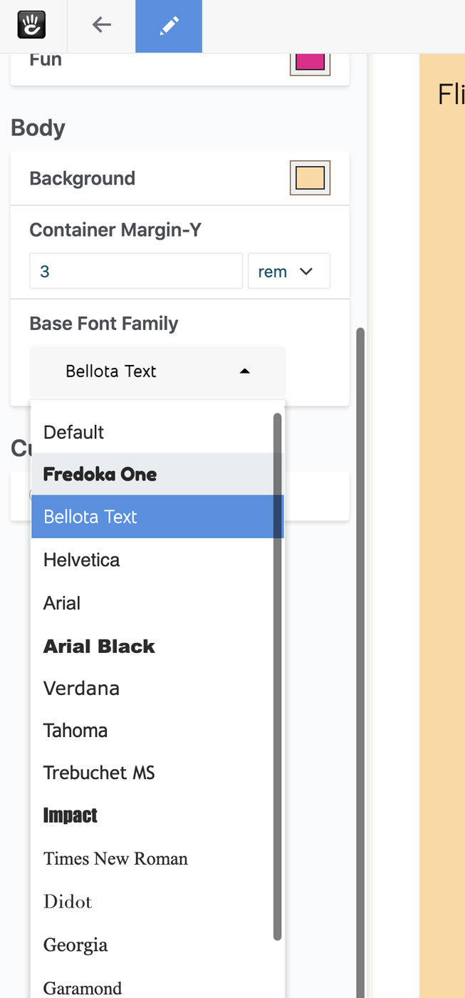
Add $font-family-base to styles.xml:
<style name="Base Font Family" variable="font-family-base" type="font-family"/>
Include this in a set in styles.xml.
Add Webfonts to Styles XML
Register any custom Google Fonts in styles.xml. Example:
<webfonts>
    <preset identifier="default">
        <font type="google" name="Fredoka One" />
        <font type="google" name="Bellota Text" />
    </preset>
    ...
</webfonts>
Place these under the <styles> node.
Final styles.xml looks like:
<?xml version="1.0"?>
<styles version="2.0" lang="scss">
    <webfonts>
        ...
    </webfonts>
    <set name="Base Colors">
        ...
    </set>
    ...
</styles>
Test Customizer
Test to confirm proper functioning and font display.
Conclusion
We successfully added a font family style to the theme, allowing customization of the base font. Next, we'll introduce a style for managing site headings.
Customizable Headers in the Type Style
Update _shared-variables.scss
Remove these styles from _shared-variables.scss:
$headings-font-family: "Fredoka One";
$headings-color: $light-blue;
$headings-font-weight: 400;
Customizable Styles
Copy Light Blue Color
Copy $light-blue from _shared-variables.scss to _customizable-variables.scss. Add these to each skin's _customizable-variables.scss:
$primary: #375d84 !default;
$secondary: #eb7724 !default;
$light: #fff !default;
$body-bg: #ffd89f !default;
$fun: #ec008c !default;

// Spacing variables
$container-margin-y: 3rem !default;

// Body Font
$font-family-base: "Bellota Text" !default;

// Headings
$headings-font-family: "Fredoka One" !default;
$headings-color: #8bb2ff !default;
$headings-font-weight: 400 !default;
Build Skins
Run:
npm run production
Update styles.xml
Add these to styles.xml:
<style name="Headings" variable="headings" type="type"/>
Include in <styles> set:
<?xml version="1.0"?>
<styles version="2.0" lang="scss">
    <webfonts>
        <preset identifier="default">
            <font type="google" name="Fredoka One" />
            <font type="google" name="Bellota Text" />
        </preset>
        <preset identifier="wilma">
            <font type="google" name="Fredoka One" />
            <font type="google" name="Bellota Text" />
        </preset>
    </webfonts>
    <set name="Base Colors">
        ...
    </set>
    <set name="Theme Custom Colors">
        ...
    </set>
    <set name="Body">
        ...
        <style name="Headings" variable="headings" type="type"/>
        <style name="Base Font Family" variable="font-family-base" type="font-family"/>
    </set>
</styles>
Test Customizer
Check the customizer's functionality with the added settings.