Features
Features Overview
Concrete's Features categorize functionality types in themes. They address specific issues in theme and block interactivity.
Block-Level CSS and JavaScript Challenges
Blocks in Concrete provide their own CSS and JavaScript, useful for interactivity. However, challenges include:
- Many blocks lead to multiple small JS and CSS file requests.
- Theme developers struggle to integrate custom support for core block types without conflicts.
- Shared code among blocks, like lightbox functionality, lacks easy customization options.
- Some blocks, like Calendar, have hard-coded JS libraries, limiting customization.
- Block-provided
view.cssfiles can't adapt to theme-specific CSS variables.
Concrete Features Solution
Features are logical groupings of shared functionality across blocks and pages. They ensure necessary JS and CSS are loaded as required. This system solves the above issues.
Examples of Core Features
- Basics, Typography, Imagery, Calendar, Boards, Video, Maps
Implementing Features in Blocks
Blocks like Content, Gallery, Image Slider, Hero Image (using Imagery), Event List, Calendar (using Calendar feature) register required Features via UsesFeatureInterface.
Features Class Registry
The Concrete\Core\Feature\Features class lists all core features as constants.
Base/Fallback Assets
Feature-related JS and CSS, built into Concrete, are used unless overridden by theme-specific assets. Example: concrete/js/features/imagery/frontend.js for an Image Slider block.
Theme Features
Themes can specify supported features, bypassing the need for fallback assets. Example: Including Features::IMAGERY signals the theme provides necessary assets for Imagery feature.
Bedrock Theme Trait Features
Using BedrockThemeTrait in PageTheme automatically supports Basics and Typography. Themes can extend this to include additional features. Bedrock theme marks these features as supported, reflecting the theme's capabilities.
Implementing Additional Features
Themes can extend the basic features by overriding or extending getThemeSupportedFeatures method. Example: Adding Imagery feature support in a theme.
Implementing Imagery Feature
Why Add Imagery Feature?
- Custom behaviors for Imagery blocks without default limitations.
- Avoid loading unused/outdated JavaScript and CSS files for Imagery blocks.
Setting Up Testing Environment
- Add a new page to the theme.
- Include all block types with Imagery feature.
Current Imagery Blocks
- Image Slider
- Hero Image
- Gallery
- Lightbox feature image
Fallback assets are currently enabling these features.
Removing Fallback Assets
- Use
getThemeSupportedFeaturesinPageThemeclass to stop loading fallback assets. Implement in
PageThemeclass:use Concrete\Core\Feature\Features; public function getThemeSupportedFeatures() { return [ Features::BASICS, Features::TYPOGRAPHY, Features::IMAGERY, ]; }
Integrating Imagery SCSS and JavaScript
- Run
npm run watchin theme directory. - Add Imagery SCSS:
- Create
_imagery.scssinassets/scss/features/imagery. - Update
main.scssto import_imagery.scss. - Include base Imagery SCSS from Bedrock.
- Create
- Customizing Imagery SCSS:
- Choose specific SCSS directives (e.g., only for hero image and gallery).
- SCSS variables automatically align with theme's variables.
Adding Imagery JavaScript
- Edit
assets/js/main.js. - Import Imagery JavaScript from Bedrock:
javascript import '@concretecms/bedrock/assets/imagery/js/frontend'; - This aligns theme's JavaScript functionality with Imagery feature blocks.
Next Steps
- Create custom interactions for Hero Image block using the Features system.
Implement Parallax Effect on Hero Images
Let’s enhance our Imagery suite's Hero Image block by adding a parallax effect using the Simple Parallax JavaScript library. This block, ideal for showcasing large images, will benefit greatly from this interactive feature.
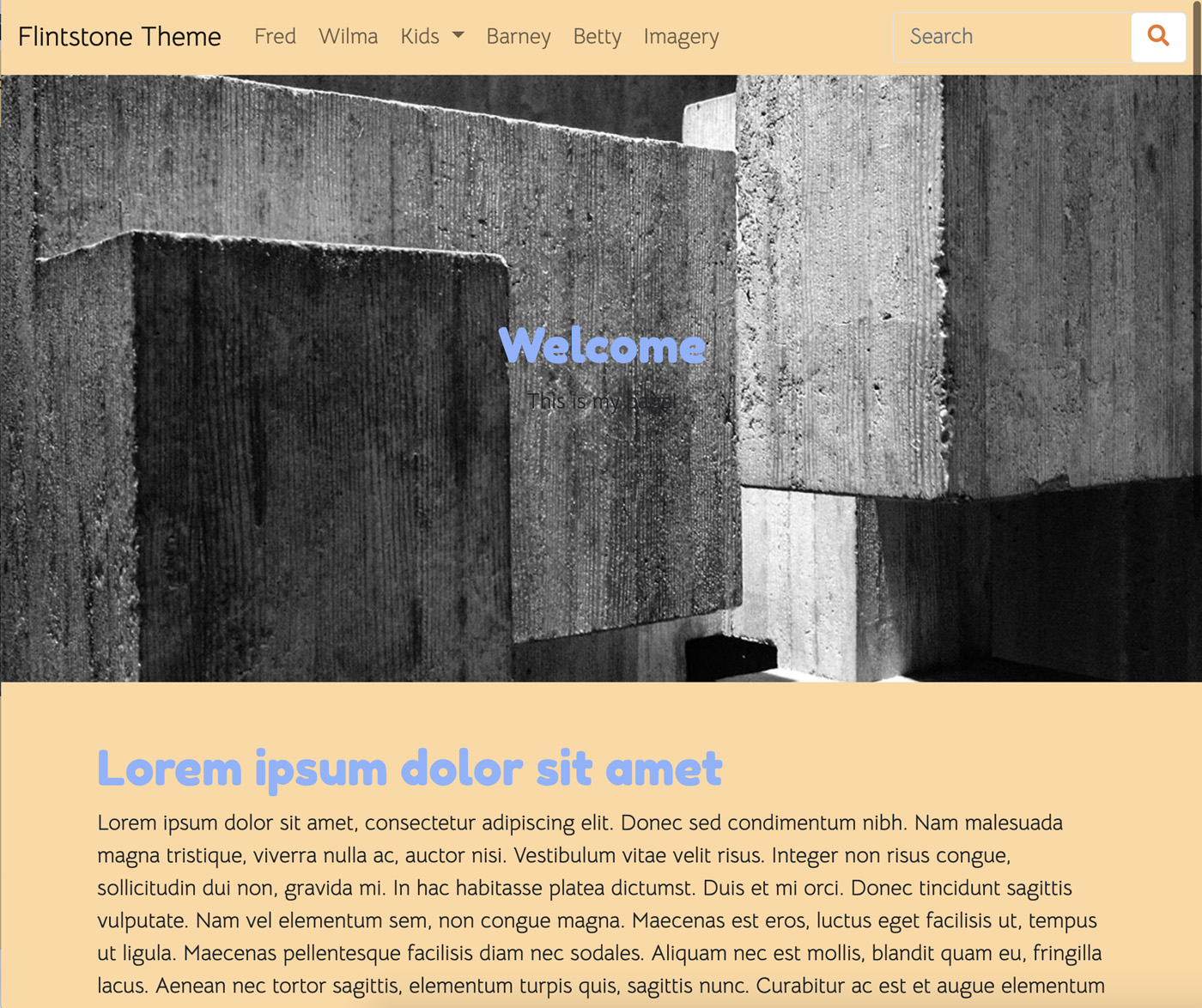
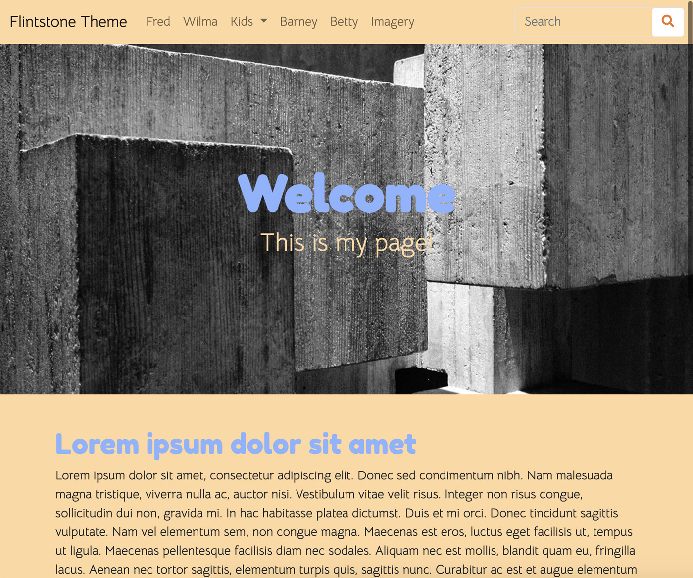
Adding the Hero Image Block
First, add the Hero Image block to a page, noting any aesthetic issues like text visibility against the background image.
Customizing Hero Image with SCSS
To address aesthetic issues, particularly for themes favoring dark images, modify the block's appearance:
- In
_imagery.scss, import a new SCSS partial for the Hero Image block (_hero-image.scss). - In
_hero-image.scss, add custom styles targeting the Hero Image block, adjusting text color to$body-bgand enhancing font size for better visibility.
Integrating Simple Parallax
Installation: Use
npmto install Simple Parallax:npm i simple-parallax-jsThis updates
package-lock.jsonand downloads the library tonode_modules/.Import in main.js: Add the following to
main.js:import simpleParallax from 'simple-parallax-js';Then, apply the parallax effect specifically to
.ccm-block-hero-image-imageelements:var images = document.querySelectorAll('.ccm-block-hero-image-image'); new simpleParallax(images, {scale: 1.5});After saving and running
npm run production, the Hero Image block will display with the parallax effect.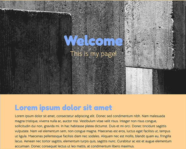
Next Steps
With the Hero Image block improved, consider further enhancements, like modifying the behavior of the Image Slider block.
Simplifying Image Slider with Owl Carousel Library
Our goal is to revamp the Image Slider block using Owl Carousel for enhanced CSS and JavaScript control. This involves:
- Installing Owl Carousel and animate.css using npm.
- Replacing existing JavaScript and CSS imports in
main.jsandmain.scsswith Owl Carousel-specific ones, while removing unnecessary libraries. - Adjusting the Image Slider block view template to align with Owl Carousel's requirements.
Steps
Install Libraries
Run in your theme directory:
npm i owl.carousel
npm i animate.css
Update JavaScript and CSS Imports
Remove the fallback Image Slider JavaScript in main.js and replace with:
import 'magnific-popup'
import '@concretecms/bedrock/assets/imagery/js/frontend/lightbox'
import '@concretecms/bedrock/assets/imagery/js/frontend/gallery'

// Owl Carousel
import 'owl.carousel'
$(".owl-carousel").owlCarousel({
    // Owl Carousel configuration
});
Update assets/scss/features/_imagery.scss to include Owl Carousel styles:
@import '~@concretecms/bedrock/assets/imagery/scss/frontend/lightbox/lightbox';
@import '~@concretecms/bedrock/assets/imagery/scss/frontend/gallery/gallery';
@import '~@concretecms/bedrock/assets/imagery/scss/frontend/hero-image';

// Owl Carousel
@import "~animate.css/animate";
@import "~owl.carousel/dist/assets/owl.carousel";
@import "~owl.carousel/dist/assets/owl.theme.default";
Customize Image Slider View Template
Create application/themes/flintstone/blocks/image_slide/view.php with Owl Carousel-specific markup, modifying concrete/blocks/image_slider/view.php accordingly.
Result
The new setup offers a distinct look and enhanced functionality compared to the standard Concrete Image Slider.
Conclusion
This exercise demonstrates the flexibility of the Concrete Features system in building custom themes with advanced functionalities.